When I saw the proposed Penrith Panthers logo for 2014, I wasn’t all that impressed.
Aside from the fact that it will disappear on a black background, they dropped the name “Penrith”, the writing of the word “Panthers” looks shit, and the Panther itself looks a bit off.
So what should a militant Penrith Panthers supporter do in this situation? Make a logo of his own of course!
I consulted with no one when it came to putting together the elements for my Penrith Panthers logo. I added all of the things I believe represent Penrith, the Panthers and everything that is good within the area.
I asked myself, what do I want from the Panther Panthers. Where do I see their future?
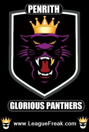
It took me some time, but this is the logo I believe the Penrith Panthers should use in 2014:
Lets be honest, its brilliant. I am nothing short of a design guru! How could anyone say the proposed logo for next year is better than the ball tearing logo I came up with!
Lets put it to a vote anyway…
Do you prefer Phil Gould’s Penrith Panthers logo that I posted on the web site earlier today, of my logo that I have posted above?
VOTE:

